There are definite advantages to indoor setups for miniature photography, not
the least of which is a finer control of lighting, protection from
caprious weather conditions, and not having uninvited extras pop into
the background just as you click the shutter. A curious mockingbird the
relative size of a pteradactyl peeking over the shoulder of your model
makes an amusing blooper shot, but it doesn't do much for proper
perspective.

One of my earliest attempts at indoor photography, this picture was taken using a poster-size photographic backdrop, an artifical turf mat, and large photo flood lights. Working with detailed backdrops and artificial lighting can be tricky, and here I didn't get it quite right as the shadows on the backdrop illustrate. I did at least get the footing to blend fairly well. The model is one of my most treasured: "Ayisha" is the Shania resin released by by Vicki Keeling, painted by one of the finest artists I ever knew, the late Kathy McKenzie.

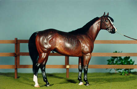
If at first you don't succeed, try again in a different location. This photo was taken on my dining room table, in a room with a lot more available ambient light. The lighting is a combination of photo floods and sunlight coming in through a large window. A simple matte blue poster served as the backdrop. The Quarter Horse stallion pictured is a top show horse and longtime favorite of mine. He was named for a best friend, and is the only model in my herd who was actually invited by his namesake to attend a birthday party. He did of course attend, and if I ever find the photo of the two "Johnny Reyes" posing together, it will certainly be added here. This "Johnny Reye" is one of the original QH1 resins by top equine artist Carol Williams. The more modest accomplishments of tack and fence are by Yours Truly.

This was actually a test shot I did on impulse, done with a quick floor setup using a calendar page backdrop (I love old calendars) and a simple felt ground mat. As the model was a considerably smaller scale than Ayisha or Johnny Reye, it was a bit easier to arrange. Conventional showing wisdom holds that you really ought to keep as much of the model in profile as possible, to give judges a good view of the horses conformation, but some individuals just beg to be taken from different angles. I can't help but love this models action and flair. This little guy is my 'rock star', an original finish Breyer Stablemate who goes by the show name of "ZZ Topper".
I've done some downsizing of my model horse herd (rather literally) and re-discovering the joys of being able to set up complete indoor dioramas on a small table or even the end of a bed. Both miniature model horses and the camera technology to photograph them have advanced at a gallop, making a rainy Sunday afternoon a perfect opportunity for a photo shoot instead of a complete washout. This Spanish gallant is "Tenaz", a Breyer Stablemate Alborozo customized by my very talented friend, and an accomplished artist, Karen Johnson. The backdrop is a simple legal size color printout of a landscape shot I took from my front yard at the time. It could be a (much) smoother transition from the footing to the backdrop, but it's always a learning process. :-)

Practice doesn't always make perfect, but it can make progress, as can upgraded equipment. This shot was done using a small, portable photo booth, which fits neatly on any tabletop or other flat surface. The backdrop was printed on a standard 8.5" x 11" sheet of paper, and Kinetic Sand used for footing. For lighting I used a battery powered Neewer LED panel light, which falls into my favorite equipment category: simple, portable, effective, and inexpensive. "Azraf", a Sarah Rose mini Nahar resin, is another small scale model, which gives me more flexibilty as to where I can set up a scene. On the downside, working with small models also requires me to wear a pair of reading glasses if any props or accessories need to be adjusted.

This is "Sombre Rivage", another custom Breyer Stablemate Alborozo, by equine artist Charlene Schnarr. My understanding is she has been doing flat canvas work for years, and only rather recently branched out into the 3-D world of model painting. Obviously, it's been an easy transition! This backdrop is another made from my own photos. There are challenges using backdrops, one of the biggest being keeping the backdrop at a proper distance-to-horizon level, and in scale. Another is finding ways to blend the diorama footing as seamlessly as possible into the backdrop. You don't want your model to look like it's standing in front of a poster! One of my favorite quickie cheats is to mask the break with a small hedge or a fence. I was impatient to photograph this gorgeous guy, and had a show entry deadline coming up, so I wound up substituting a hastily made cardboard single rail for the wooden dressage fence I was planning. I'm hoping Rivage is distracting enough for the judges until I get the wooden fence finished and his photos redone. ;o)

Eventually I ventured out and about for some more landscape shots. Here "Grand Illusion" is strutting his stuff in front of a proper riding stable. This Breyer Stablemate Hanoverian was customized by the very talented Brienna Bowles-Cundiff, and if I ever lose my mind enough to attempt to show any of my mini models in performance, he'll be one of the first to get saddled up. In the meantime, he just has to show off freestyle. The nicely manicured pasture in the backdrop is a miniature photographer's dream - it *almost* perfectly matches the model footing, and makes the whole more harmonious. Just to be sure, and somewhat out of habit, I went ahead and used a low hedge to mask the footing break. A few weeks after taking this photo I found a white three rail fence I made years ago (of course!), that happens to be a perfect match for the fence in the backdrop photo. I will definitely be redoing this shot as well. I do think it turned out nicely with the miniature hedge, but I think it will look a lot better with the miniature fence!

My mini three rail fence does work well with this backdrop, and there's no more need for a small hedge: the bottom rail of the fence nicely masks the footing to backdrop border. I still felt I needed to add a bit more. Charlie Brown, a Breyer Stablemate Django customized by the ever-imaginative Dani Marshall, has a wonderfully curious and engaged expression about him. It only made sense to give him a playmate, so he'd have something to be curious and engaged with. I'm not one to throw in companion animals or other extras unless they genuinely add to the scene, and help tell some sort of story, if even only a short one. Charlie is a great example of a model that isn't doing a lot, but he's doing just enough that I could have some fun with him.

It's a lot of fun to take your own backdrop photos, but it can be almost as much fun to scout around for pre-existing materials. Calendars can be a great source, and while I don't buy calendars specifically to use the pages as backdrops when the year is out, I absolutely do go through all mine (and those of anyone else who will give them to me) at year end to see what might be useable. Some small rocks and hobby landscaping moss helped mask the break for this shot, and the backdrop is very suitable for "Mojave Rose", a lovely Sarah Rose "Nevada" mustang mare resin. I wish I could credit the painting artist as well as the sculpting artist, but her previous owner did not know who painted her, nor did the owner before her. All we have to go on is the initials "E.P." on her belly. If anyone out there recognizes this sweet little lady, or these initials, please drop me a line. I'd love to know more about about my Maiden of Mystery. :o)

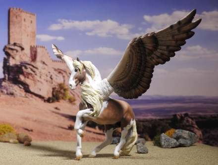
What's even more fun than scouting for cool backdrops? Using the same cool backdrop for a completely different type of model for a completely different effect. To showcase my magnificent Pegasus "Thorontur" (that's "Power of an eagle" in Elvish, for those who aren't fluent) I used the same backdrop as for Rosie, but pulled back to use more of it and bring in the castle on the horizon. Thor was created from a Breyer Stablemate Alborozo by the awesomely talented and wildly creative Tamarrion Covington, and I could just sit and stare at him...and have done so more than once, LOL. This is another shot I with which I am not unhappy, but which I do want to do over. The footing break is not well masked, and I'd really rather try and *match* the footing to the sandy slope in the background, and create more of a real cliffhanger (bad pun intended) where the scene drops off into a canyon behind him. I also need to work on improving the lighting. Thor's impressive wingspan throws a shadow across his body in this setup. The underside of his wing is also in shadow, which I'd like to correct to some degree, to bring out the beautiful color and detail. At the same time, I don't want to spotlight him to the point where the lighting looks too artificial. I'm guessing it's going to be a balancing act, and probably involve a bounce card or two. It's always a learning experience!

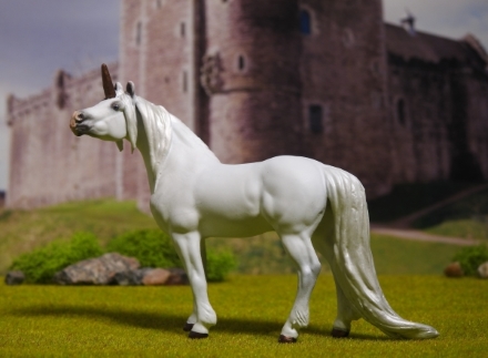
This regal steed was created by equine artist Linda Elkjer from the Breyer Stablemate standing Warmbold mold, and I tried several different backdrops, and castles, before I decided this one suited him best. What I really like about this shot - besides the magestic subject - is how the foreground footing blends smoothly into the background scenery, which rises up fairly naturally into a hill behind the model. I deliberately masked only half of the break with rocks and moss, as through the viewfinder the shot looked like it would work that way, and happily it did. Yay! The dark shading on the side of castle obviously can't be helped, but I rather like the atmosphere it adds. One minor quibble: the shadow angle on the castle is at odds with the shadow on the model, if you stop to really think about it. Otherwise, "Andaerion" would have his shadow cast in the same direction as the shadow cast on the castle. I *might* try this setup again with a different lighting angle, but as it stands I'm pretty happy with it overall. It's a nice picture, if I do say so myself, and it's my very own Unicorn - how cool is that? :o)